用html+css实现仿头条的点赞效果,代码如下:
html代码:
<button type="button" id="agree-btn" class="detail-like like">
<div class="digg-icon"><div class="inner"><i></i></div></div>
<span class="agree-num">1</span></button>
css代码:
.p_like button[disabled] .digg-icon{
    background: #fff2f2;
}
.p_like button[disabled] .digg-icon i {
    -webkit-transform-origin: -16% 66%;
    -moz-transform-origin: -16% 66%;
    transform-origin: -16% 66%;
    -webkit-animation: like .7s forwards;
    -moz-animation: like .7s forwards;
    animation: like .7s forwards;
    background-image: url(https://lf3-cdn2-tos.bytescm.com/toutiao/toutiao_web_pc/svgs/like_active.b265cb30.svg);
}
.p_like button[disabled] .agree-num{
    color: #f04142;
}
.detail-like {
    text-align: center;
    cursor: pointer;
    color: #222;
    outline: none;
    background: white;
}
.detail-like .digg-icon {
    position: relative;
    border-radius: 24px;
    width: 48px;
    height: 48px;
    background: #f8f8f8;
}
.detail-like .digg-icon .inner {
    position: absolute;
    top: 50%;
    left: 50%;
    -webkit-transform: translate(-50%,-50%);
    -moz-transform: translate(-50%,-50%);
    transform: translate(-50%,-50%);
    font-size: 0;
}
.detail-like .digg-icon i {
    display: block;
    width: 24px;
    height: 24px;
    background: url(https://lf3-cdn2-tos.bytescm.com/toutiao/toutiao_web_pc/svgs/like.0caed57a.svg) no-repeat 50%;
    background-size: contain;
}
.detail-like>span {
    display: inline-block;
    margin-top: 4px;
    font-size: 12px;
    line-height: 20px;
}
@-webkit-keyframes like {

    0%,
    to {
        -webkit-transform: rotate(0deg);
        transform: rotate(0deg);
        -webkit-animation-timing-function: ease;
        animation-timing-function: ease
    }

    20% {
        -webkit-transform: rotate(-20deg);
        transform: rotate(-20deg);
        -webkit-animation-timing-function: cubic-bezier(.66, 0, .34, 1);
        animation-timing-function: cubic-bezier(.66, 0, .34, 1)
    }

    48% {
        -webkit-transform: rotate(8deg);
        transform: rotate(8deg);
        -webkit-animation-timing-function: ease-in-out;
        animation-timing-function: ease-in-out
    }

    75% {
        -webkit-transform: rotate(-1deg);
        transform: rotate(-1deg);
        -webkit-animation-timing-function: ease;
        animation-timing-function: ease
    }
}

@-moz-keyframes like {

    0%,
    to {
        -moz-transform: rotate(0deg);
        transform: rotate(0deg);
        -moz-animation-timing-function: ease;
        animation-timing-function: ease
    }

    20% {
        -moz-transform: rotate(-20deg);
        transform: rotate(-20deg);
        -moz-animation-timing-function: cubic-bezier(.66, 0, .34, 1);
        animation-timing-function: cubic-bezier(.66, 0, .34, 1)
    }

    48% {
        -moz-transform: rotate(8deg);
        transform: rotate(8deg);
        -moz-animation-timing-function: ease-in-out;
        animation-timing-function: ease-in-out
    }

    75% {
        -moz-transform: rotate(-1deg);
        transform: rotate(-1deg);
        -moz-animation-timing-function: ease;
        animation-timing-function: ease
    }
}

@keyframes like {

    0%,
    to {
        -webkit-transform: rotate(0deg);
        -moz-transform: rotate(0deg);
        transform: rotate(0deg);
        -webkit-animation-timing-function: ease;
        -moz-animation-timing-function: ease;
        animation-timing-function: ease
    }

    20% {
        -webkit-transform: rotate(-20deg);
        -moz-transform: rotate(-20deg);
        transform: rotate(-20deg);
        -webkit-animation-timing-function: cubic-bezier(.66, 0, .34, 1);
        -moz-animation-timing-function: cubic-bezier(.66, 0, .34, 1);
        animation-timing-function: cubic-bezier(.66, 0, .34, 1)
    }

    48% {
        -webkit-transform: rotate(8deg);
        -moz-transform: rotate(8deg);
        transform: rotate(8deg);
        -webkit-animation-timing-function: ease-in-out;
        -moz-animation-timing-function: ease-in-out;
        animation-timing-function: ease-in-out
    }

    75% {
        -webkit-transform: rotate(-1deg);
        -moz-transform: rotate(-1deg);
        transform: rotate(-1deg);
        -webkit-animation-timing-function: ease;
        -moz-animation-timing-function: ease;
        animation-timing-function: ease
    }
}
以上是完整代码,可以直接复制使用。
标签: html
上面是“html+css仿头条的点赞效果”的全面内容,想了解更多关于 前端知识 内容,请继续关注web建站教程。
当前网址:https://ipkd.cn/webs_2071.html
猜你喜欢
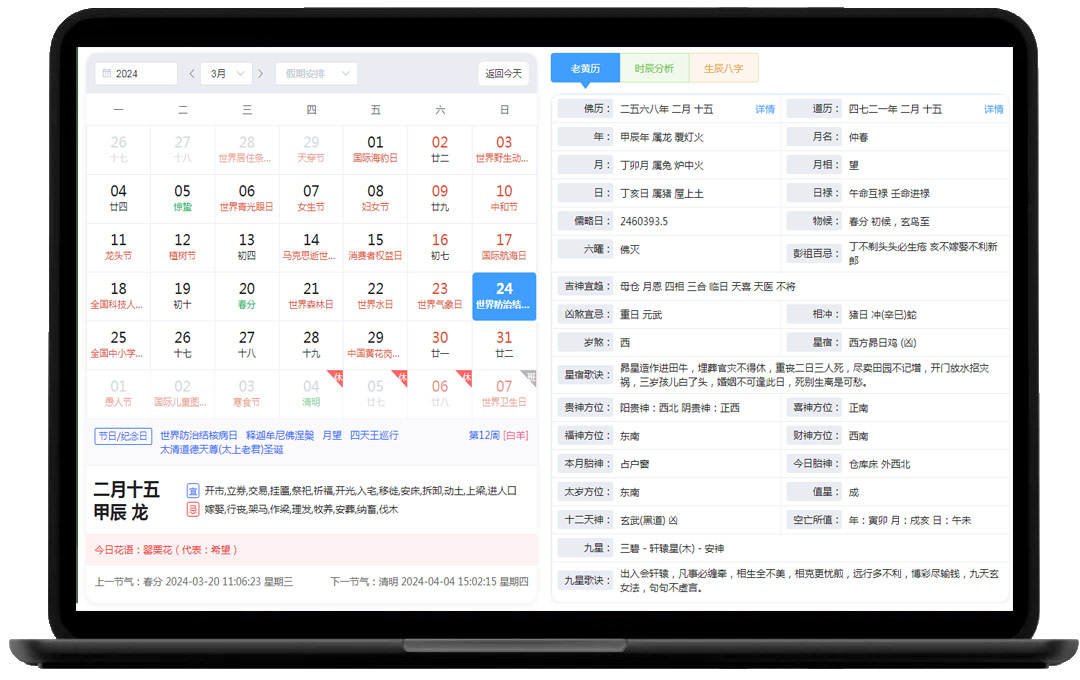 一个包含老黄历、佛历、道历、星宿等数据的日历网站
 3D立体人物效果
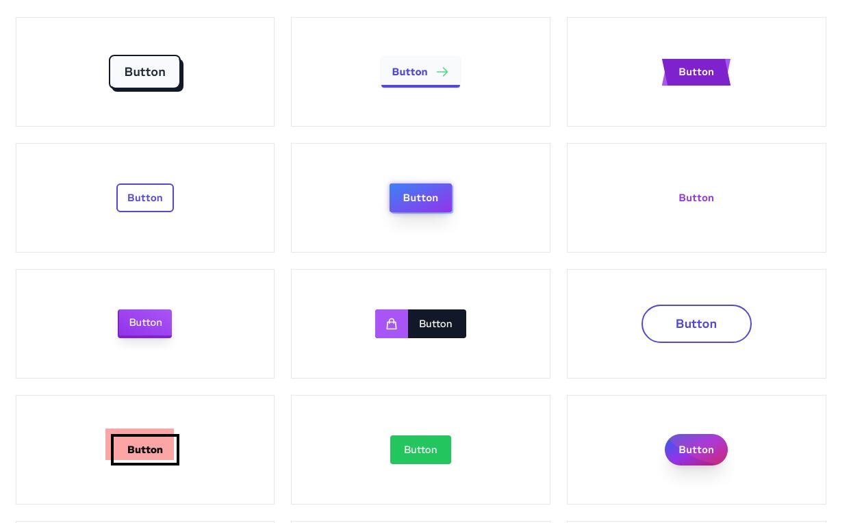 利用CSS3代码编写45款按钮效果
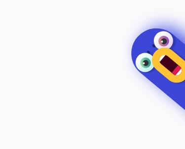 css3绘制一个会动的大嘴鸟
 自动打字效果(惊喜在后面)
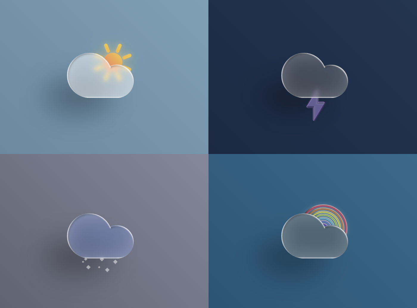 css3做一个风雨雷电天气动态图标
 css3卡片动态滑动效果
 RTvue 低代码开发平台
声明:本站提供的所有资源部分来自互联网,如果有侵犯您的版权或其他权益,请发送到邮箱:admin@ipkd.cn,我们会在看到邮件的第一时间内为您处理!