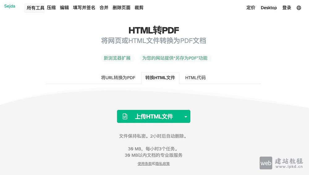
web建站教程
  1. 首页
  2. vuejs
  3. js
  4. 好玩
  5. AIGC工具
  6. 前端知识
  7. 百度echarts
  8. 更多
    php入门
    nodejs
    mockjs
    reactjs
    mysql
    wordpress
    织梦cms
    帝国cms
    git教程
    IT知识
    模板大全
    休息站
    手机应用

html+css仿头条的点赞效果

2114 ℃

html+css实现仿头条的点赞效果,代码如下:

html代码:

复制代码<button type="button" id="agree-btn" class="detail-like like">
<div class="digg-icon"><div class="inner"><i></i></div></div>
<span class="agree-num">1</span></button>
  • 1
  • 2
  • 3

css代码:

复制代码.p_like button[disabled] .digg-icon{
    background: #fff2f2;
}
.p_like button[disabled] .digg-icon i {
    -webkit-transform-origin: -16% 66%;
    -moz-transform-origin: -16% 66%;
    transform-origin: -16% 66%;
    -webkit-animation: like .7s forwards;
    -moz-animation: like .7s forwards;
    animation: like .7s forwards;
    background-image: url(https://lf3-cdn2-tos.bytescm.com/toutiao/toutiao_web_pc/svgs/like_active.b265cb30.svg);
}
.p_like button[disabled] .agree-num{
    color: #f04142;
}
.detail-like {
    text-align: center;
    cursor: pointer;
    color: #222;
    outline: none;
    background: white;
}
.detail-like .digg-icon {
    position: relative;
    border-radius: 24px;
    width: 48px;
    height: 48px;
    background: #f8f8f8;
}
.detail-like .digg-icon .inner {
    position: absolute;
    top: 50%;
    left: 50%;
    -webkit-transform: translate(-50%,-50%);
    -moz-transform: translate(-50%,-50%);
    transform: translate(-50%,-50%);
    font-size: 0;
}
.detail-like .digg-icon i {
    display: block;
    width: 24px;
    height: 24px;
    background: url(https://lf3-cdn2-tos.bytescm.com/toutiao/toutiao_web_pc/svgs/like.0caed57a.svg) no-repeat 50%;
    background-size: contain;
}
.detail-like>span {
    display: inline-block;
    margin-top: 4px;
    font-size: 12px;
    line-height: 20px;
}
@-webkit-keyframes like {

    0%,
    to {
        -webkit-transform: rotate(0deg);
        transform: rotate(0deg);
        -webkit-animation-timing-function: ease;
        animation-timing-function: ease
    }

    20% {
        -webkit-transform: rotate(-20deg);
        transform: rotate(-20deg);
        -webkit-animation-timing-function: cubic-bezier(.66, 0, .34, 1);
        animation-timing-function: cubic-bezier(.66, 0, .34, 1)
    }

    48% {
        -webkit-transform: rotate(8deg);
        transform: rotate(8deg);
        -webkit-animation-timing-function: ease-in-out;
        animation-timing-function: ease-in-out
    }

    75% {
        -webkit-transform: rotate(-1deg);
        transform: rotate(-1deg);
        -webkit-animation-timing-function: ease;
        animation-timing-function: ease
    }
}

@-moz-keyframes like {

    0%,
    to {
        -moz-transform: rotate(0deg);
        transform: rotate(0deg);
        -moz-animation-timing-function: ease;
        animation-timing-function: ease
    }

    20% {
        -moz-transform: rotate(-20deg);
        transform: rotate(-20deg);
        -moz-animation-timing-function: cubic-bezier(.66, 0, .34, 1);
        animation-timing-function: cubic-bezier(.66, 0, .34, 1)
    }

    48% {
        -moz-transform: rotate(8deg);
        transform: rotate(8deg);
        -moz-animation-timing-function: ease-in-out;
        animation-timing-function: ease-in-out
    }

    75% {
        -moz-transform: rotate(-1deg);
        transform: rotate(-1deg);
        -moz-animation-timing-function: ease;
        animation-timing-function: ease
    }
}

@keyframes like {

    0%,
    to {
        -webkit-transform: rotate(0deg);
        -moz-transform: rotate(0deg);
        transform: rotate(0deg);
        -webkit-animation-timing-function: ease;
        -moz-animation-timing-function: ease;
        animation-timing-function: ease
    }

    20% {
        -webkit-transform: rotate(-20deg);
        -moz-transform: rotate(-20deg);
        transform: rotate(-20deg);
        -webkit-animation-timing-function: cubic-bezier(.66, 0, .34, 1);
        -moz-animation-timing-function: cubic-bezier(.66, 0, .34, 1);
        animation-timing-function: cubic-bezier(.66, 0, .34, 1)
    }

    48% {
        -webkit-transform: rotate(8deg);
        -moz-transform: rotate(8deg);
        transform: rotate(8deg);
        -webkit-animation-timing-function: ease-in-out;
        -moz-animation-timing-function: ease-in-out;
        animation-timing-function: ease-in-out
    }

    75% {
        -webkit-transform: rotate(-1deg);
        -moz-transform: rotate(-1deg);
        transform: rotate(-1deg);
        -webkit-animation-timing-function: ease;
        -moz-animation-timing-function: ease;
        animation-timing-function: ease
    }
}
  • 1
  • 2
  • 3
  • 4
  • 5
  • 6
  • 7
  • 8
  • 9
  • 10
  • 11
  • 12
  • 13
  • 14
  • 15
  • 16
  • 17
  • 18
  • 19
  • 20
  • 21
  • 22
  • 23
  • 24
  • 25
  • 26
  • 27
  • 28
  • 29
  • 30
  • 31
  • 32
  • 33
  • 34
  • 35
  • 36
  • 37
  • 38
  • 39
  • 40
  • 41
  • 42
  • 43
  • 44
  • 45
  • 46
  • 47
  • 48
  • 49
  • 50
  • 51
  • 52
  • 53
  • 54
  • 55
  • 56
  • 57
  • 58
  • 59
  • 60
  • 61
  • 62
  • 63
  • 64
  • 65
  • 66
  • 67
  • 68
  • 69
  • 70
  • 71
  • 72
  • 73
  • 74
  • 75
  • 76
  • 77
  • 78
  • 79
  • 80
  • 81
  • 82
  • 83
  • 84
  • 85
  • 86
  • 87
  • 88
  • 89
  • 90
  • 91
  • 92
  • 93
  • 94
  • 95
  • 96
  • 97
  • 98
  • 99
  • 100
  • 101
  • 102
  • 103
  • 104
  • 105
  • 106
  • 107
  • 108
  • 109
  • 110
  • 111
  • 112
  • 113
  • 114
  • 115
  • 116
  • 117
  • 118
  • 119
  • 120
  • 121
  • 122
  • 123
  • 124
  • 125
  • 126
  • 127
  • 128
  • 129
  • 130
  • 131
  • 132
  • 133
  • 134
  • 135
  • 136
  • 137
  • 138
  • 139
  • 140
  • 141
  • 142
  • 143
  • 144
  • 145
  • 146
  • 147
  • 148
  • 149
  • 150
  • 151
  • 152
  • 153
  • 154

以上是完整代码,可以直接复制使用。

html各种特殊字符转义对照表介绍

html中的doctype是什么?

jquery如何删除html属性值

webpack中可以打包html资源吗?

html和css有哪些禁止元素拖拽的代码

标签: html

上面是“html+css仿头条的点赞效果”的全面内容,想了解更多关于 前端知识 内容,请继续关注web建站教程。

当前网址:https://ipkd.cn/webs_2071.html

声明:本站提供的所有资源部分来自互联网,如果有侵犯您的版权或其他权益,请发送到邮箱:admin@ipkd.cn,我们会在看到邮件的第一时间内为您处理!

当前位置: 网站首页 > 前端知识
本文共计3344个字,预计阅读时长23分钟
生活小工具,收录了80多款小工具
上一篇: 推荐一款完全免费的 Windows 软件卸载、清理工具——HiBit Uninstaller
下一篇: 推荐一款可免费商用圆体字库——江城圆体
回到顶部
x 打工人ai神器