如何利用css3实现光效效果,下面web建站小编给大家简单介绍一下实习代码!
1、定义一个div标签
<div class="card">
  IPKD.CN
</div>
2、css3样式
@property --rotate {
  syntax: "";
  initial-value: 132deg;
  inherits: false;
}

:root {
  --card-height: 65vh;
  --card-width: calc(var(--card-height) / 1.5);
}


body {
  min-height: 100vh;
  background: #212534;
  display: flex;
  align-items: center;
  flex-direction: column;
  padding-top: 2rem;
  padding-bottom: 2rem;
  box-sizing: border-box;
}


.card {
  background: #191c29;
  width: var(--card-width);
  height: var(--card-height);
  padding: 3px;
  position: relative;
  border-radius: 6px;
  justify-content: center;
  align-items: center;
  text-align: center;
  display: flex;
  font-size: 1.5em;
  color: rgb(88 199 250 / 0%);
  cursor: pointer;
  font-family: cursive;
}

.card:hover {
  color: rgb(88 199 250 / 100%);
  transition: color 1s;
}
.card:hover:before, .card:hover:after {
  animation: none;
  opacity: 0;
}

.card::before {
  content: "";
  width: 104%;
  height: 102%;
  border-radius: 8px;
  background-image: linear-gradient(
    var(--rotate)
    , #5ddcff, #3c67e3 43%, #4e00c2);
    position: absolute;
    z-index: -1;
    top: -1%;
    left: -2%;
    animation: spin 2.5s linear infinite;
}

.card::after {
  position: absolute;
  content: "";
  top: calc(var(--card-height) / 6);
  left: 0;
  right: 0;
  z-index: -1;
  height: 100%;
  width: 100%;
  margin: 0 auto;
  transform: scale(0.8);
  filter: blur(calc(var(--card-height) / 6));
  background-image: linear-gradient(
    var(--rotate)
    , #5ddcff, #3c67e3 43%, #4e00c2);
    opacity: 1;
  transition: opacity .5s;
  animation: spin 2.5s linear infinite;
}

@keyframes spin {
  0% {
    --rotate: 0deg;
  }
  100% {
    --rotate: 360deg;
  }
}
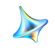
效果图如右上角~
css3如何利用Flex实现响应式表格布局(Flex弹性布局)
上面是“利用css3实现光效效果”的全面内容,想了解更多关于 前端知识 内容,请继续关注web建站教程。
当前网址:https://ipkd.cn/webs_3000.html
声明:本站提供的所有资源部分来自互联网,如果有侵犯您的版权或其他权益,请发送到邮箱:admin@ipkd.cn,我们会在看到邮件的第一时间内为您处理!